|
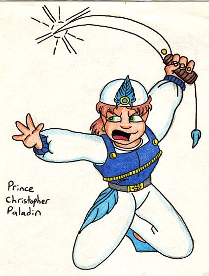
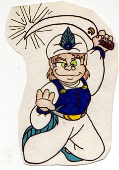
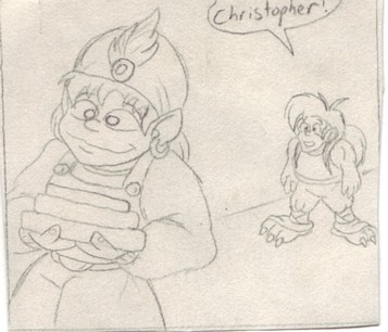
Ugh. Drawing of Christopher done for a non-credit advanced cartoon course I took in college. Most of my stuff from that class didn't turn out too well, or ended up looking rather creepy. 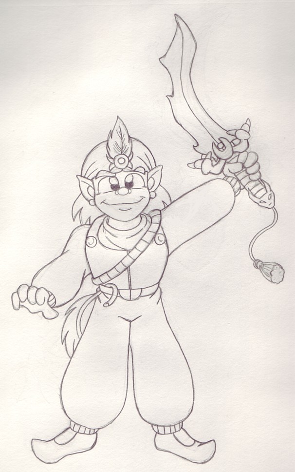 I drew this picture of Christopher Paladin recently. I'm working on redesigning him, but I don't want to change him too much from the original version. I just want to him to be drawn better. 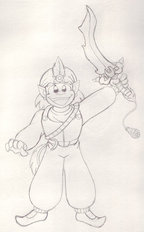 Same drawing as above, but with his mouth open. One reason I was working on this character is that I noticed that many of my more recent drawings of him weren't very good. I actually liked some of my older versions more. I'm trying to churn out something that's more acceptable on a technical level, and yet still remains true to the original concept. Part of the problem I was having is that I kept making subtle changes to the character throughout my years of drawing him in both the Image Arcane and RAU comics. Part of this was due to my skills improving from continual practice and natural maturation, but some of it seemed attributable to second-guessing myself. Observe:
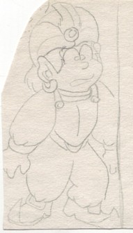
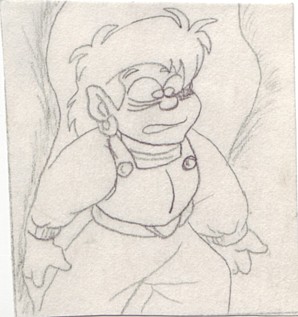
This is one of my original conceptual drawings of Christopher that I still have (not counting the version that had a mustache). Uh, yeah, it's rather frightening and poorly-drawn and he looks so much like the pigeon that inspired him, it isn't funny. Being a minion of Leohtiss, technically desert-elves are Light Demons, so I don't mind that Christopher has this slight quirk that gives the impresson of being bird-like or possibly dragon-like, which would more obviously indicate that he's not exactly human than just the pointed ears. But this is too much. His humanoid side needs a little more room to breathe here. 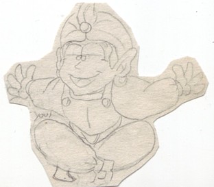 This is from an old storyboard in either the third or fourth episode of Image Arcane. (I believe Christopher was introduced in the third episode). This was actually drawn before the above picture. I didn't always draw conceptual art of the characters before drawing them onto the storyboards. In fact, I'd usually storyboard a very basic design first, and then go draw more-detailed and revised versions separate from the comics that I'd implant into the final drafts. Christopher is a large-headed character by design, but it's a little too ridiculously big here, and his nose is slightly different. It's smaller and pointier than usual.
Two storyboards of Christopher in a very similar pose from two different episodes. The one on the left is older. Although he's not wearing his hat in the righthand picture and he has a scar under his eye, you can still see how the design was slightly improving over time.
This storyboard is from an even later episode than the two above. The most interesting change in this design is that his eyes have become separated. Before, they were really close together, which gave him a much more "cartoonish" look than many of the other cast members who weren't drawn that way. Strangely enough, I found drawings of Christopher done after this one in which his eyes had been placed back together again. On a side note, I love how happy and oblivious Christopher looks in this picture. If you had to describe his personality in only three words "happy and oblivious" would be a good way to do it, and I think it's funny that he looks that way even when he's just doing some random chores. 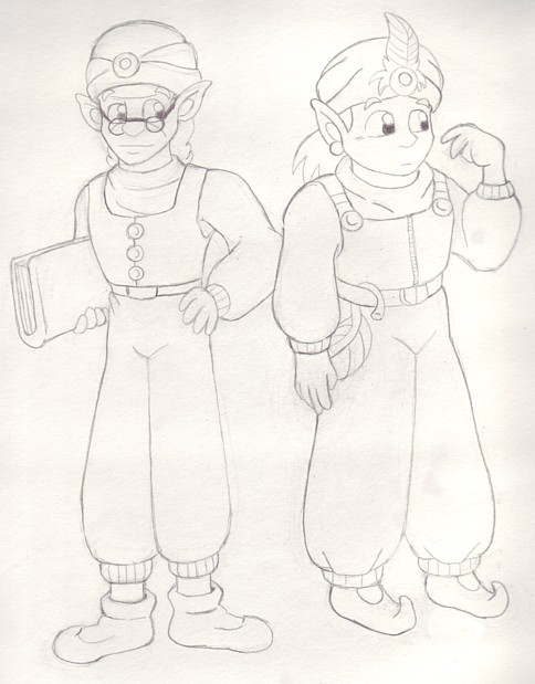 A side-by-side comparison of the series' two most prominent desert-elves, Preston and Christopher. This was the first I drew Preston in YEARS, so it's a little messed-up, but not nearly as bad as those old drawings of him.
Christopher is either stuck in an orange spider-web or getting stabbed with a giant fork. I don't really know.
Gaelia's confusion is completely understandable here. A really tall teenage elf with an enormous head and dressed like a genie can easily be mistaken for any number of things. |
BACK TO CHRISTOPHER PALADIN SCRAPBOOK PAGE 6 | GO TO CHRISTOPHER PALADIN SCRAPBOOK PAGE 8
 |
|
 |
